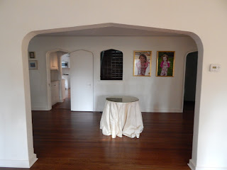
The Entry Hall proper is long, 28' feet.
I like it as a gallery of sorts very spare. Others felt it needed something but what that something was no one seemed to know. The center table NO. You can see the earlier post about design "rules" that should but don't work here.
The bench, a super consignment shop find, came out great but has been positioned all over the space.
Ultimately the bench was placed under the children's portraits. "The Dude" will get his portriat at age 3(their faces are better formed rather then just baby and no he will not be wearing the floral jumper). "The Dude's" spot is on the other side of the opening up the stairs, also known as "Baby Jail".
The art on the walls is big and good.
The space between the doors to the Dining and Family Rooms that was the real issue. It is tall, narrow and bang in your face.
We tried sculpture, pedestals and small tables. Nothing worked... we kept slamming into everything, even though there is plenty of room and points of egress. This mysterious magnetic pull is same reason we do not have an island in the kitchen. We cannot process that there is a large immobile object. The children take a full body slam, I get it right in the hip bone, the husband get it right in the gut knocking the wind out of him. When we go into others houses we make ourselves put our hands on the islands edge to physically register "LARGE IMMOBILE OBJECT DO NOT EMBERASS YOURSELF".
A piece mounted tight to the wall that fits the 9'6" x 14" wide space that I can afford and is not totally lame, has a little edge, plays well with what is there, and I want it now is what I need. The universe says, "Bite Me".
Did it ever....
"Bite Me" by Wells Mason
|
The title of the work alone. I had to have it.
Wells Mason is a designer and a sculptor. His specialty is combining seemingly disparate materials, like exquisite hardwoods coupled with salvaged steel.
Unlike an ordinary craftsman, there’s also an intellectual component to much of Mason’s work. With a careful hand and a broad vocabulary, Mason crafts a sometimes humorous, sometimes scathing message that’s equally concise and complex. via Generous Art
"Bite Me" was available through Generous Art of Austin Texas. When original fine art is purchased through Generous Art, 30% of the sale price is donated to the charity of your choice, 50% goes to the artist and 20% to Generous Art.

Generous Art was founded by Jennifer Chenoweth, an artist. Following a series of conversations with her friends about creativity and business, about how valuable community is to our lives, how to give back for all we are grateful for, about the lack of transparency in the art business, and about how artists get supported and their work valued.
The works represented by Generous Art encompass all mediums, price points and they are a pleasure to work with. One is quickly reminded of what art in its purest form is meant to be... a pleasure to the eye and a lift to the spirit.
"Bite Me" was available through Generous Art of Austin Texas. When original fine art is purchased through Generous Art, 30% of the sale price is donated to the charity of your choice, 50% goes to the artist and 20% to Generous Art.
Generous Art was founded by Jennifer Chenoweth, an artist. Following a series of conversations with her friends about creativity and business, about how valuable community is to our lives, how to give back for all we are grateful for, about the lack of transparency in the art business, and about how artists get supported and their work valued.
The works represented by Generous Art encompass all mediums, price points and they are a pleasure to work with. One is quickly reminded of what art in its purest form is meant to be... a pleasure to the eye and a lift to the spirit.
The two older children decided the harts represented each of them, "because mommy loves each one of us". The bite out of the harts? "Because sometimes mommy gets annoyed with us."


